

Your Phone is Designed to be Addictive
The three elements that keep you attached
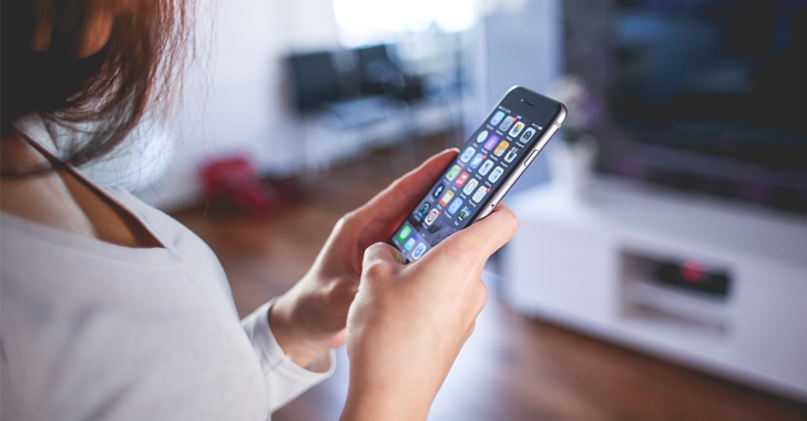
It’s no secret, everyone loves their phone. They make life easier; with the simple push of a button you can order a ride, get automatic updates on the world and see what your friends are up to on several platforms. However, this ease of use has its downfalls. As usage tracking apps collect and report your personal data, more and more people are beginning to accept the reality of tech addiction. Users have reported over 40 hours a week spent on their phones- and it’s not 100% their fault.
Tech giants and software companies produce extremely large profits just off of usage. While you scroll across social media, these corporations rake in hundreds of millions off of your time spent doing so. So in order to do so, companies use a few key tricks to keep you on your phone and making them money.
Push Notifications
When Blackberry rolled out the push notification feature on its classic slide phone in 2002, they were actually intended to let the user spend less time on their phone. The software would organize your newly received emails into short, easily read messages that one could view on their home screen instead of having to check their phone every few minutes.
But by 2009, newer smartphone companies like Apple and Samsung realized the potential of Push Notifications, and began to design their devices with notifications to pull in the user.
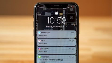
As of 2020, all apps now use some sort of notification feature. Whether it’s social media, productivity or just a game, an update on any aspect of the app can be sent to you 24/7, and every detail of it is designed to further pull you in.
Push Notifications pull on a user’s psychological desire for social interaction. When receiving a text notification, a user can feel that person reaching out to them . Apps have designed their notifications to mimic these messages. Key characteristics include keeping the notification short, using common language and even using first names. This simulated communication gives a user the same feeling as a personal text, making them more likely to open up their phone and use the application.
Additionally, social media sites pull on one’s desire to be included. This “fear of missing out” (FOMO) is taunted and utilized to pull someone back on an app. As usual, Instagram and Facebook are at the forefront. See examples below.
Instagram: “User1 commented on User2’s post”
“User3 is going live with User4”
Facebook: “3 of your friends responded to an event near you”
“John Doe is celebrating with Jane Doe”
By making users feel left out and personally needed, the push notification has changed how people interact with their phone. If you find yourself spending too much time on your phone, try turning off all push notifications except phone calls and text messages.
Colors
Humans LOVE color. Bright clothing and colorful advertisements always do best, and it’s no coincidence. The human eye is attracted to bold colors and shades. Deep reds, bright blues and combinations of direct complementary colors attract eyes more than others, and phones use this to their advantage. For an obvious example, look at notification bubbles. They’re bright red, grabbing your focus and demanding your attention.
But there are a few, more secretive, ways that color is utilized. Take a look at Instagram’s logo before and after they rebranded.
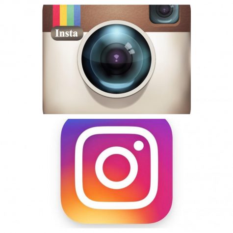
Now of course the new logo relies on elements of modern design, but there is a scientific element to the composition as well. The experiments done to determine the aforementioned “attractive” colors consisted of showing subject a board full of different colors and patterns and seeing where their eyes go first. These experiments essentially simulated someone opening their phone and seeing what draws them in first. By using the findings and incorporating them into their logos, these social media apps are effectively making sure that someone looks at their app as soon as they open their phone.
Although this might make the look of your phone quite drab and boring, turning on “Grayscale” in settings is effective at reducing this effect. By removing color, social media apps and productivity apps initially look the same, and could help reduce unnecessary usage.
Infinite Scroll
This feature of social media is by far the most dangerous. With the simple swipe of a finger, media can be consumed in a never ending cycle, causing a user to spend more time on an app than they initially planned. This continuous creation of content can be seen on essentially all social media platforms including Snapchat, Instagram, Facebook, TikTok, Tumblr, Reddit and more. 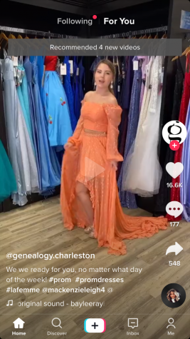
The infinite scroll feature plays on human’s reliance to react based on visual cues. For example, if someone looks at a bowl of popcorn and sees that it is empty, they will stop reaching for more. But with this feature, more and more content is laid out ahead of the user, causing them to be lost in a downward spiral.
Even websites like Youtube have begun to use this feature. In the past, when a video was complete a new video had to be selected by the viewer. But now with “Autoplay”, a new video is automatically loaded and played as soon as the current one is done. Streaming services use this feature as well, automatically cueing up the next episode in a series.
If endpoints are put in place, people almost never exceed what they initially thought. How often do you go on to the second page of Google? Have you ever? Google’s end caps keep the average internet searcher from venturing down rabbit holes, and it seems to work fairly well.
If you struggle with spending too much time on social media apps, try setting a timer to remind yourself how long you have spent on an app. Alternatively, a time restriction can always be set in your settings to automatically close an app once you’ve maxed out on a certain amount of time in a day.