
Academic Magnet High School is a powerhouse of an institution. We have an intelligent student body and resilient sports teams. But our spirit, intelligence, and athletics aren’t always accurately portrayed. This begs the question: does our logo fully encapsulates all it is to be a Raptor? In looking into the symbols of Magnet, I found quite a few. They vary from seriously academic to classically athletic. But in making more than one logo, was the quality overlooked? Should we ditch a couple logos for the singular perfect one? Or do they all need a revamp? 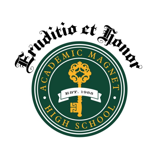
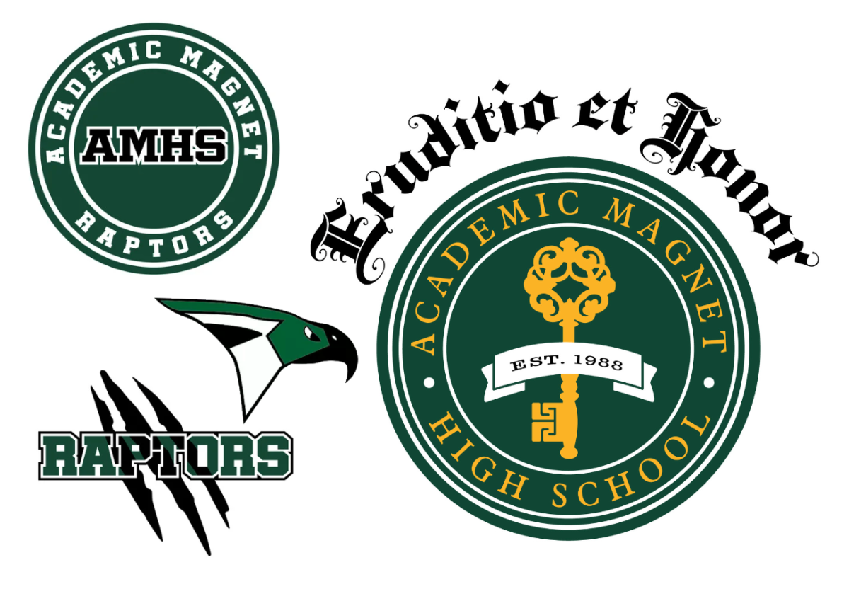
Up first is the classic Magnet key. Despite what I expected to be an easy review of the go to logo, this logo surprised me. I was unaware of the Latin phrase that is written above. I am a huge fan of the sophistication of this particle emblem, save for the phrase at the top. It clutters the logo and there is too much going on. The black writing doesn’t fit the classy aesthetic of the rest of the logo and it draws your eyes away from the center point. I can barely pick up the school it belongs to because the firm lettering. But if it is being judged simply off the circular design, I would venture to give it a 10/10. It has the intricate key design without being overbearing, creating an aesthetic look. The lettering even matches our new bright yellow walls around the school. But the perfect score cannot stand with the Latin hanging above the circle. Therefore, I rate this logo a 7/10 with a strongly intelligent atmosphere. To make this logo perfect I would remove the phrase that’s above the circle.
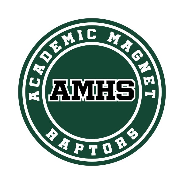
Next we have a more casual, classic logo. The comfort of this logo can be chalked up to the athletic vibe of this piece. This comes across in the inclusion of “Raptors” at the bottom of the circle. The “Raptors” subtly shouts out the athletes and sprinkles in some school spirit. The vintage font really pulls this logo together. Atmosphere is a 11/10. Now onto the cons. Well, we include both Academic Magnet and AMHS. Incredibly redundant, we are all capable of deducing what school this is without repeating it twice.
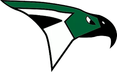
I think this logo would be much improved with the raptor head in the middle (however that brings its own issues into the mix as this is probably due for a revision a well). Despite its repetitive flaws, the overall classic high school appeal brings a much needed chill to the feel to Academic Magnet. Though it is a subtle logo, it focuses on athletics and earns an overall score of 9/10. To make this logo perfect, I would first fix the raptor head to look more complex and realistic and then I would insert this into the logo where it says “AMHS. ”
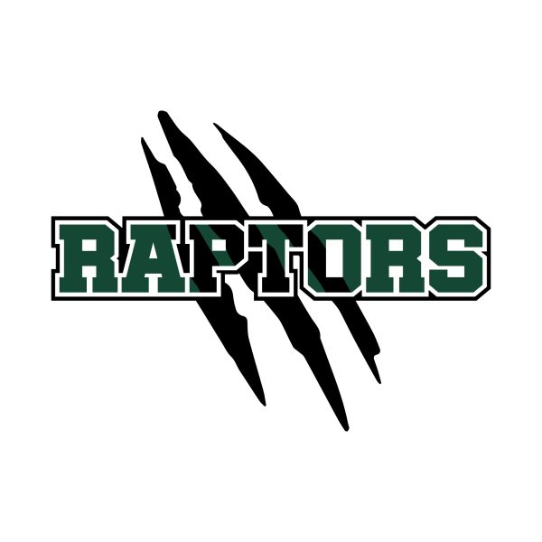 Although fierce and powerful aren’t the words that immediately come to mind when I think of Magnet sports, this logo proved me wrong. The claw mark in the back references the damage that we Raptors can do. I also see it as an homage to the Birdcage, a recent revival in what we call our student section. On a side note, there is a brand new banner in the gym depicting the Birdcage- go check it out. This logo is big and bold, representing the spirit of Magnet, which is thriving at the moment (shoutout to new Athletic Director: Coach Knauer). This logo definitely focused on the athletics and spirit of Magnet. However, I would deduct points for the likeness of colors in the dark green and black. Also, unless you are familiar with Magnet it is difficult to figure out that this logo belongs to Magnet. Overall, I would rate this logo a 8/10. To make this logo perfect I would use the lettering of Raptors and add Academic Magnet in a way smaller font right above it. Bonus points- both Sutton Meyer and Addie Hanna said this one was their favorite logo.
Overall, I think that the logos that we have are a good representation for the spirit of the school. I think with a few minor tweaks we could have some real winners. Reviewing the logos has proved to me that in this case quantity matters because we need a separate logo for academics, athletics, and spirit. What logo is missing? I think we need a logo that correctly represents all three of these traits. Maybe scratch marks made of the Magnet keys and Academic Magnet writing over it? Who knows?