


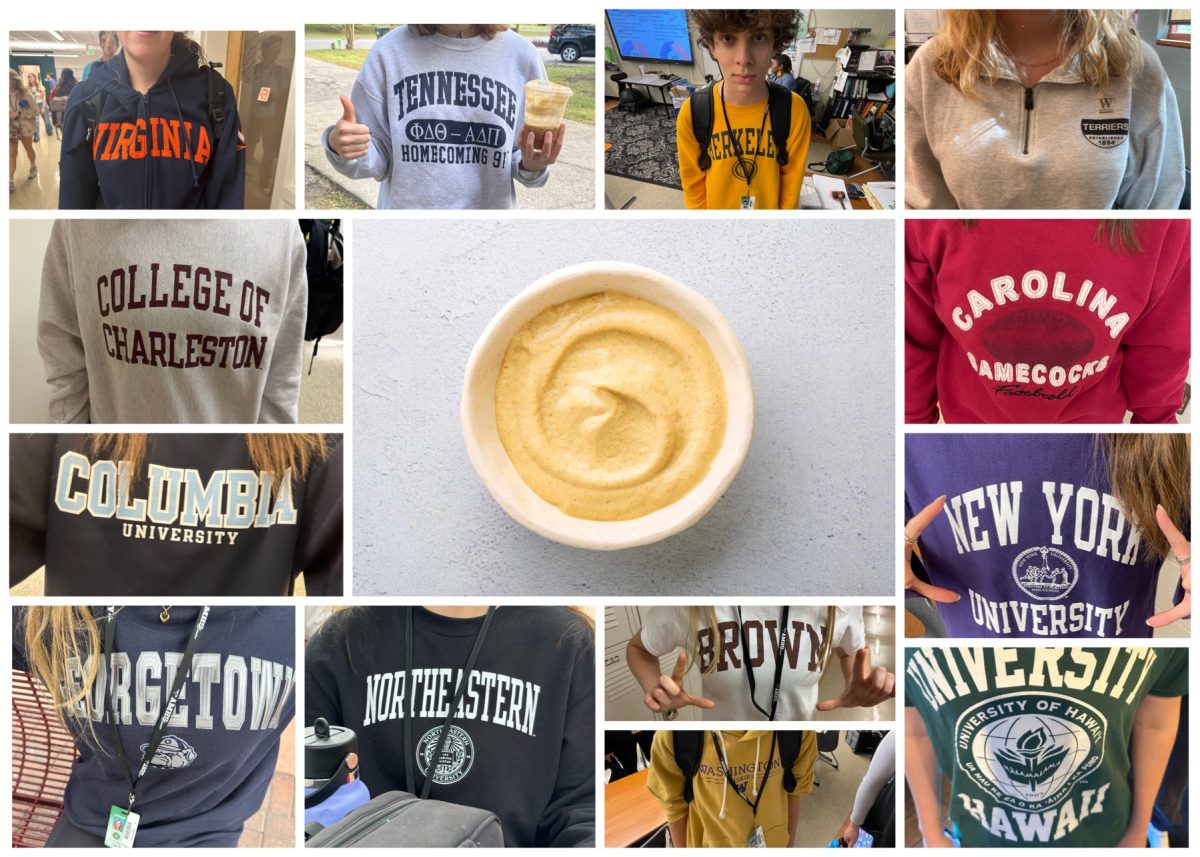
In the midst of college deadlines season for the Class of ’24, many ready-to-fly Raptors can be seen around the halls wearing college merch, whether it be to manifest acceptances or simply just to rep the schools they’ve visited. We’ve decided to rank some of the ones we’ve seen this past week.
Disclaimer: These are completely just our opinions and have no correlation with our opinions on the schools these items are from. Do not take the opinions in this article too seriously.
Georgetown University (crewneck)

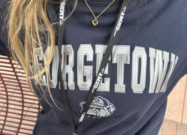
JZ: I would give this an 8.7/10 as it’s the classic style of a college sweatshirt. I personally love the font of the letters and how it’s embroidered instead of just printed on the sweatshirt. The addition of the mascot under the university name is also a nice touch. The combo of the mascot and the embroidery brings attention to the sweatshirt and lets you know it’s associated with a prestigious university. The sweatshirt is also a good material and could keep you warm and comfort you as you await college decision letters in the winter.
MB: I would give this an 8.9/10. I think that the silver lettering and logo are very unique and add a 3D appearance to the design. In addition, the material is warm and thick, perfect for the chilling temperatures of this week.
Northeastern University (crewneck)
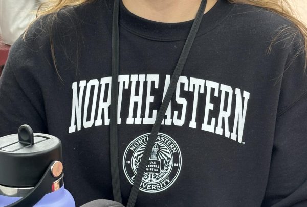
JZ: Similar to the Georgetown sweatshirt, I like the classic style of this one, but I’ll be giving it a 6.5/10 due to how the letters are plainly just printed onto the sweatshirt. I feel like it is just very simple and could possibly be made at home by someone with a Circuit. The color palette is both sophisticated and emo as it just features black and white. Adding the school’s red color would result in a higher rating.
MB: Where is the red coloring of their university? This crewneck seems too simple, especially for a college. The thickness of the lettering does not aesthetically match the thinness of the logo. This makes it appear as though they were meant to be added on two different sweatshirts. In addition, I would prefer some color. Maybe instead of white lettering, it should be red? I think that would be a more accurate representation of Northeastern’s colors. It is not an unappealing sweatshirt, nevertheless, the blandness of it results in a review of 6.2/10.
Brown University (t-shirt)
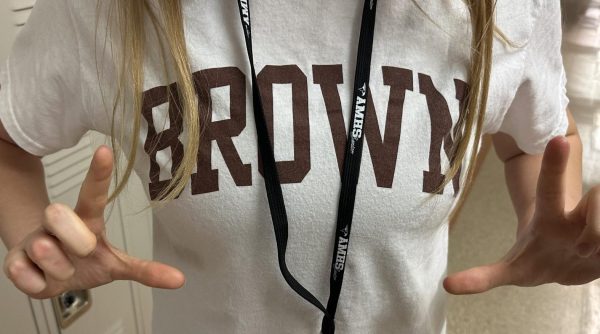

JZ: I hate to say it, but I give this shirt a 5/10. It’s simply just the name of the school printed on a plain shirt. There isn’t much variety, but I guess I do like the font. Also, the two colors don’t really go well together in this style. I understand that brown is one of the school colors, but maybe if they inverted the colors, the shirt would look better, with a brown background and white letters. If you were unaware of the university, you would think someone was just wearing a shirt with the name of a color written on it. The neckline of the shirt also seems to be a little tight and high up.
MB: This shirt reminds me a lot of a Brandy Melville shirt. It is cute and simple, however, there’s nothing super special or unique about it. Despite that, the font and coloring of the design are cute. I don’t really have anything more to say about this shirt, so I’ll give it a 4.9/10.
NYU (crewneck)
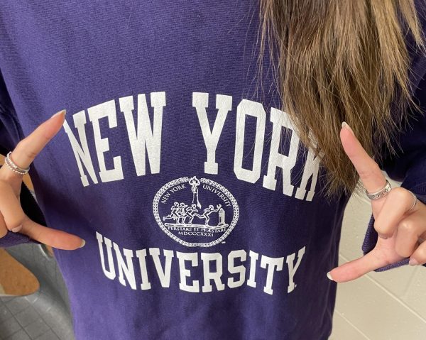
JZ: Not to be biased…but I would give this a 9/10. I really love the purple coloring with the combination of the white lettering. It’s all just very NYU. You could be walking through Central Park and be able to spot this sweater from a mile away. It easily gives away the fact that it’s associated with the university.
MB: I really like this crewneck, so much so I would give it an 8.8/10. The design is neither too small nor too large. The name of the university and the logo are proportional to one another, unlike some of the other articles of clothing in this review. Even the coloring is accurate to the school. As Goldilocks would say, “it’s just right!”
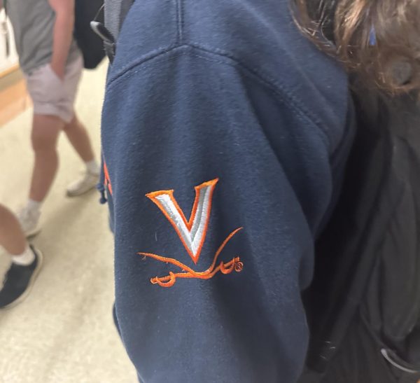
University of Virginia (zip-up)
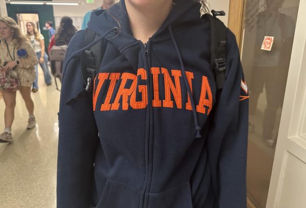
JZ: I give this an 8.5/10. I love that it’s a zip-up, and the design is very nice. The orange is a nice pop of color and a good contrast to the navy. This zip-up is perfect for the current weather as you can zip it up to stay warm, but if needed you can leave it unzipped for some nice ventilation.
MB: This has got to be one of my favorite pieces of college merch seen throughout the halls of Magnet. The zip-up design is unique and a nice change of scenery. I love the coloring, font, and small UVA logo on the sleeve. Absolutely no complaints! Without knowing the comfort level, I would give this zip-up a 9.9/10.
University of Washington (hoodie)


JZ: I have to say…this one was a little tough to look at, resulting in a rating of 3.5/10. The colors remind me of Wario. I’m not particularly a fan of Wario. The letters are also really skinny but there’s so much hoodie, leaving a lot of empty space below the words, as they’re also placed quite high up the front of the hoodie. Furthermore, this dijon mustard color is not even a part of the University of Washington’s school colors. The drawstrings of the hoodie also look quite frail. I know it’d just take one wash for them to come out or become completely frayed. The only reason I did not rank it lower is because the person wearing it would be upset…
MB: I really don’t understand who allowed the Washington Huskies to make this sweatshirt. The coloring is really odd and the design is a tad bland. It’s simply the writing and their basic logo on a sweatshirt. At least add the more ‘fun’ and interesting logos. Maybe a husky…just a thought. In addition, the Huskies’ colors are more predominantly purple, with an accent color of yellow, however, it is not, as Jasmine stated, the dijon mustard color. There is more gold in Washington’s color scheme. Which begs the question…why use the dijon mustard yellow as the predominant color on the sweatshirt?? After stepping away from the photo and thinking on it, I decided that it wasn’t as bad as I initially thought. However, I saw the sweatshirt once again in person and decided that, out of 10, I would give it a 4/10.
UC Berkeley (crewneck)

JZ: One word: luminescent. I have extreme confidence that if I was looking for this individual in the dark, I’d find them in less than a second, without a doubt. The individual has upgraded from a dijon to a german mustard. Jokes aside, I’d give this a 6/10, the coloring does confuse me but I don’t hate it. It has the classic college sweatshirt style.
MB: What is this student’s obsession with yellow college sweatshirts? This is yet another sweatshirt of theirs that has the wrong yellow coloring. UC Berkeley’s color is more gold, and less german mustard.. Yet again, there was so much empty space on this sweatshirt. The lettering takes up so much more space than the logo, which makes it appear a little disproportionate. Despite this, I do like this sweatshirt slightly better than the other one they were wearing. Overall, I would give it a 4.6/10. (I’m really sorry to this student, but I am just bothered by the yellow background colors of your sweatshirts. It’s not you, it’s me.)

German mustard for reference.
Columbia University (crewneck)
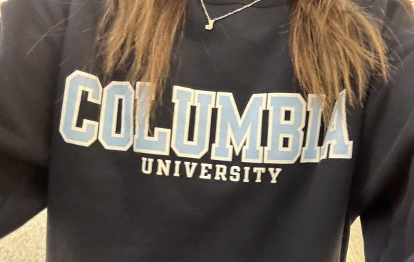
JZ: Trying to lead away from bias as I am the one who owns this sweater, I give it a 6.5/10 for the same reasons I gave the Northeastern sweater the same rating. The letters are just plainly printed on but I like how there’s more of a color palette. The Columbia baby blue inside the letters is a nice touch with the combo of the navy blue as the base color. All the colors of the school are nicely implemented into the sweater and the material is also quite soft. This is a good option as a pullover on days with cold mornings and warm afternoons or just whenever you need to quickly go outside you can just throw this on and out the door you go.
MB: I’m sorry Jasmine, but I am not the biggest fan of this particular sweatshirt. I think it’s actually too simple and the lettering looks simply printed on with, as Jasmine has said in an earlier review, a Circuit machine. For this reason, I would have to give it a 5/10.
JZ: Um. Rude.
University of Hawaii (t-shirt)
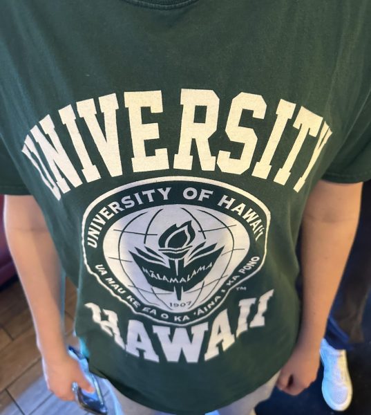
JZ: Maybe I’m biased as a raptor, but I love the green of this shirt. The shade is really nice and opposite to Milla, I kind of like how it’s just so “in-your-face” that it’s the University of Hawaii, leading to a rating of 7/10. The material also looks quite nice and it seems like a solid casual shirt to wear when a laundry day is much needed.
MB: I really liked the design, font, and coloring of this shirt. In addition, I was pleasantly surprised to see any item of clothing repping the University of Hawaii. Unlike some of the other college merch we have reviewed in this article, this shirt’s design is actually too big in my opinion. I think they tried to fit way too much on the shirt and didn’t want to compromise on the size of either the logo or the writing. Because of the “in-your-face” design, I will have to rank this shirt a 6.3/10.
University of Tennessee, Knoxville (crewneck)
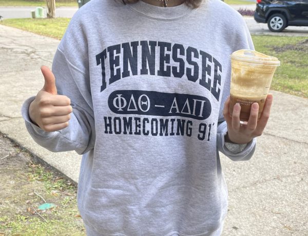
JZ: I give this a solid 8/10. I just love the little vintage vibe that it gives. It’s just one of those sweaters that seems like it’d get passed on from generation to generation (honestly, I can’t tell if that’s because I know that it was passed down or not). I feel like I would find this at a thrift store and think it was a steal. I agree with Milla, I don’t particularly like the error with 91’ but besides that, I like the lettering and colors.
MB: Although this is not a sweatshirt that I bought from a college, I guess we can still count it. This was actually my dad’s sweatshirt when he was at UT. It is a really comfortable crew neck and perfectly oversized. I would like to point out that whoever designed and printed this sweatshirt did not do a grammatical check, seeing as instead of the year being printed as ‘91, it was printed as 91’. Because of this small, grammatical error I would have to rank this sweatshirt an 9.4/10, although this may be a bit of a biased review. Maybe trust Jasmine’s review over mine…
Wofford College (quarter zip)
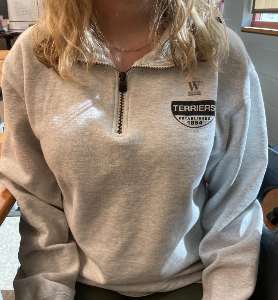
JZ: The fact that this is a quarter zip already would result in a higher rating except, as Milla explains below, the two logos are confusing me a bit. I’m sensing the designer could be someone indecisive. However, I like the heather grey color and how nicely the neckline folds down, 6/10.
MB: I am a huge fan of quarter zips. It is different from the typical pullover sweatshirt that is a common sight throughout the halls of Magnet. I really like the idea of its simplistic design, with the logo in the corner. However, this is yet another piece of merchandise that has a disproportionate layout. The Wofford “W” logo is too small when compared to their other logo. In addition, I don’t think it is necessary to include both logos. Please just pick one or the other. Moving on from the design, the sweater itself looks thick, warm, comfortable, and high-quality. Despite its odd double-logo, I would probably buy this sweater because of how comfortable it looks, which leads me to give it a ranking of 5.7/10.
College of Charleston (crewneck)
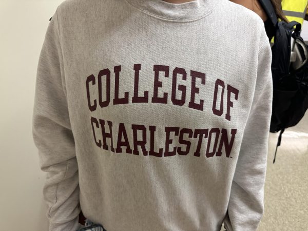
JZ: Classic college style, nice and simple 7/10. Displays the college colors well in the letters. Again, another nice pullover option when you need something quick to put on before heading out.
MB: I like how simple it is. It looks really comfortable. The simplicity of it allows you to wear it with a multitude of colors. I would also give it a 7/10.
William and Mary (hoodie)
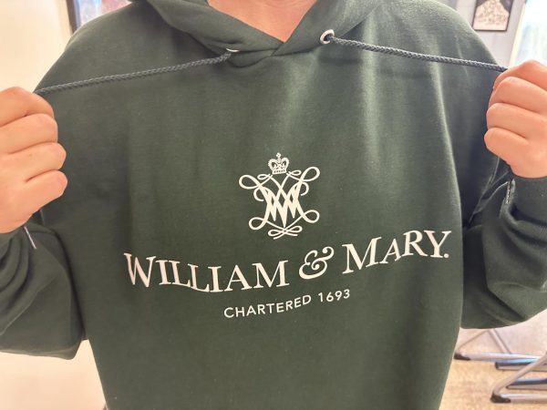
JZ: Just because I already love the color and the fact that it’s a hoodie, 8.9/10. Honestly, one of my favorite pieces that we’ve reviewed. The simplicity and the fit just goes really well. If I owned this hoodie, I think I’d definitely wear it at least once a week. Love.
MB: I like the coloring as well as the design. I particularly like the sizing of the logo and the name, it’s perfectly proportionate to the hoodie. I have nothing else to say so I’ll give it an 8.3/10.
Honestly, writing these reviews really burnt us out…so we hope you enjoyed or at least found a little amusement in reading our article. Maybe we’ll return in the future when decisions are out. #GoRaptors
We’re haunted by the dijon.


jilla • Dec 5, 2023 at 3:09 pm
i would love to see a part two of this article