Ranking NBA City Jerseys
Breaking Down the Top Ten NBA City Jerseys of the 2022-2023 Season
As the NBA season hits its midway point and the All-Star break approaches, one topic that’s been on the minds of basketball fans is the release of the City Edition jerseys. Each year, NBA teams unveil a new City Edition jersey that celebrates their community and its unique history and culture. The jerseys are often a departure from the team’s usual design and can showcase bold colors, intricate patterns, and make references to local landmarks and icons.
This year’s compilation of City Edition jerseys has been particularly noteworthy, with standout designs from teams like the Los Angeles Lakers, the Brooklyn Nets, and the Miami Heat. As we approach the All-Star break, fans are eager to rank the best and worst City Edition jerseys of the season. So whether you’re a die-hard fan or a casual observer, get ready to dive into the world of NBA jerseys and discover which teams are making the biggest style statements this year. To explain my method, I chose the jerseys purely on visual appeal, not on their meaning. All images are courtesy of ESPN.
10. Detroit Pistons
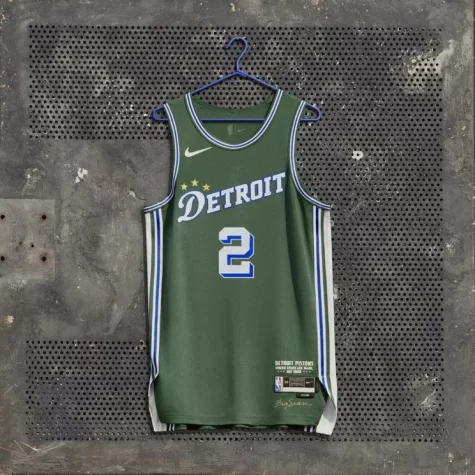
For background, the Detroit Pistons Director of Creativity and Innovation is Big Sean, the rapper; so, he played a major role in the designing of the jersey. The jersey is meant to represent Saint Cecilia’s Gymnasium, also known as “The Saint,” which features green walls. The church gym has served as a safe haven for those wanting to play basketball within the dangerous city; fostering some NBA players like Magic Johnson and Jalen Rose. The three stars above the D represent the three NBA championships which the Pistons have attained. Overall, the symmetry and colors of the jersey hold it in the top 10.
9. Boston Celtics
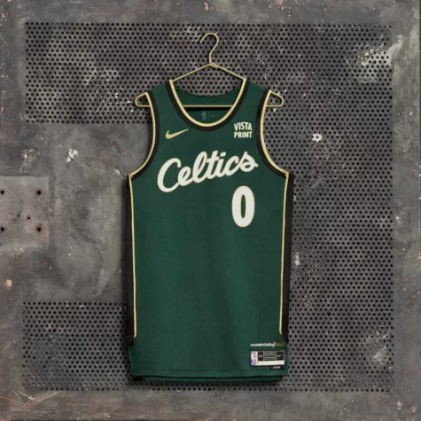
This is a clean jersey! It gives off retro-vibes, while incorporating the classic green and gold combination. The cursive of the team name reinforces the original uniforms from years ago. The uniforms are meant to be a tribute to Bill Russell, who amassed 11 championships in 13 years with the Celtics. This era was known as the “Golden Era,” hence the “Champions of Gold” in the bottom right corner. The jersey tops off the tribute with 11 golden stars along the sides of the jersey.
8. Minnesota Timberwolves
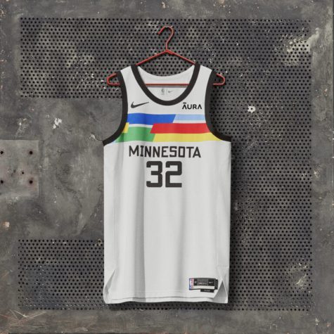
Each Minnesota city jersey is unique: when you purchase a jersey, you are guaranteed a unique color combination, printed specifically for you. The jersey is meant to represent the state of Minnesota’s many diversely talented citizens. The vibrant colors on each jersey give off a modern-feel, all encased by the simple, black stitchings. Overall, the uniqueness of each color pattern on purchased jerseys deserves immense credit, aside from the actual appearance of these.
7. Chicago Bulls
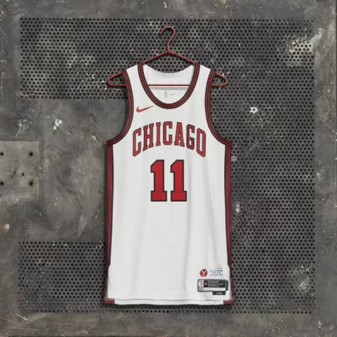
There seems to be a trend—the simpler the jersey, the more visually appealing. The Bulls’ jersey is meant to be an ode to Chicago’s architecture. In the bottom right corner, you can see the municipal “Y,” meant to represent how three branches at the Chicago River come together at Wolf’s Point, an area in downtown. The sides of the jersey feature five vertical stripes which come together, to represent the unity of the five players on the court. It may be hard to notice, but the city jersey also features a rustic red color, a little off from the normal color, which is a representation of the rustic bridges throughout the city. Overall, the jersey is very sleek and sticks to its roots.
6. New York Knicks
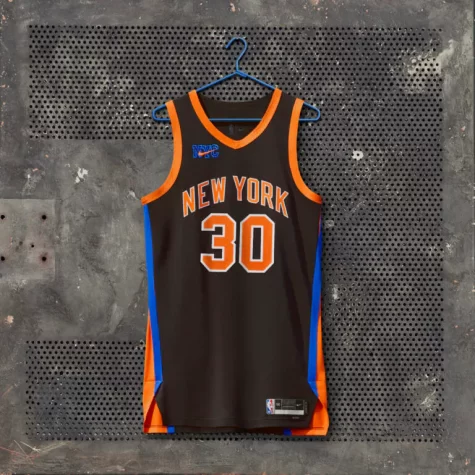
It would be pretty embarrassing to have the most populated city in the United States and not have a good city jersey. New York kept it simple. The way the orange and blue seep in on the sides make the jersey seem like the cape of a superhero. The jersey is meant to bridge the gap between the old Knicks’ jerseys and the new Knicks’ jerseys. The V-neck incorporates jerseys from the late 90s and early 2000s, while the NYC swoosh logo reiterates the iconic Nike partnership. Although Knicks fans are rarely happy, they have nothing to complain about with these jerseys.
5. Cleveland Cavaliers
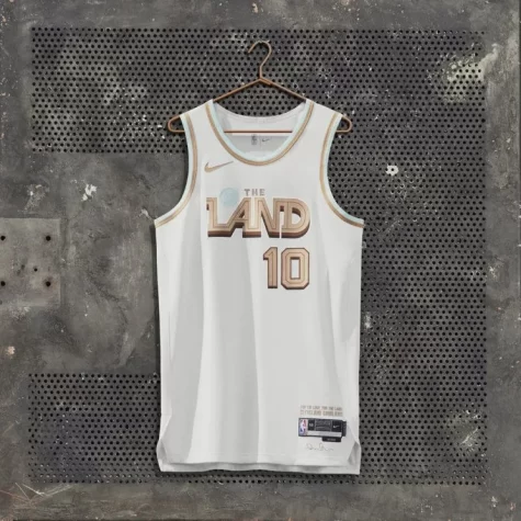
The Cav’s jersey could easily be anywhere in the top five. Writing this, I almost regret putting it at 5, but its ranking shows the immaculate designs that teams came up with this year. For those who do not know, “The Land” is a nickname for Cleveland, given to it by its inhabitants. The Cavaliers are known to be a very prideful fanbase, especially after beating the Golden State Warriors in the NBA Championship led by Lebron James. There is not much symbolism, except the blue ball is meant to represent Lake Erie. Overall, the jersey is extremely visually appearing with its mix of red, gold, and black.
4. Oklahoma City Thunder
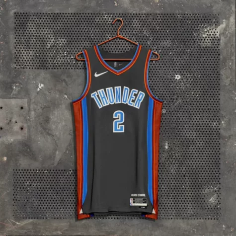
The simplicity and symmetry of the Thunder’s city jersey is something which we should all get behind. The patterned stripes down the sides which match the neck and arm stitchings are extremely optically appearling. In all fairness, a city in Oklahoma has to do something to stand out. There are seven stripes down the sides of the jersey which are meant to represent the 77 counties within the state. In the bottom right of the jersey, “The Oklahoma Standard,” is written which conveys the three values of the citizens: Service, Honor, and Kindness.
Overall, this jersey deserves much more recognition than it is currently receiving.
3. Los Angeles Lakers
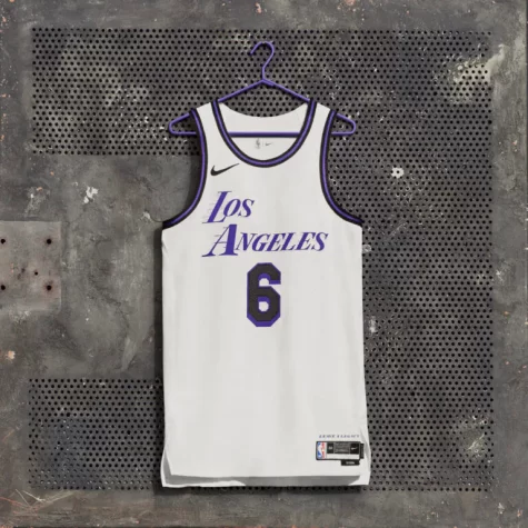
The Lakers were bound to come up with something good with Lebron at the held. Frankly, the purple brings out a better vibe than yellow. Although it deviates from the classic Lakers’ jerseys, this year’s city jersey is extremely clean. The jersey is meant to be a change from typical city jerseys. Typically jersey’s represent the city, while the Lakers intended for this year’s to be relatively simple, as if the city was stripped down to its foundational structures. Overall, there really isn’t much more to go into aside from the aesthetically-pleasing design.
2. Toronto Raptors
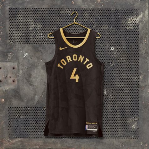
Frankly, this is the biggest sleeper on the list. The Raptors’ jerseys feature a camo-like background with the 6 Toronto boroughs in a tint of gray. The combination of gold and black is about as distinguished as it can get, giving viewers a royal, yet militaristic feel. For fans of the Raptors, this jersey should be an instant-buy.
1. Atlanta Hawks
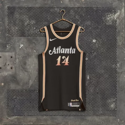
The jersey is titled “Peachtree Street,” an ode to a famous street in Atlanta. The Hawks clearly bring out the peachy colors along the stitchings and on the number. As Turner Orvin, a senior, noted, “Those are so clean.” The greatest part of this jersey is the font. The casual, yet prominent font represents Atlanta well, conveying the cultural influence and growth of the city. Not much else can be said; the Hawks win with a simple, yet powerful design.
Comment which team you think had the best city jersey!

