


After several rainy days, a hurricane, and numerous cancellations, the Academic Magnet Class of 2026 has officially completed their senior parking spot painting with various degrees of success. While senior spots are simply a form of self expression for the senior class, Magnet has taught me that anything can be graded. So, without further ado, here are my rankings for a few of the 2025-2026 senior parking spots.
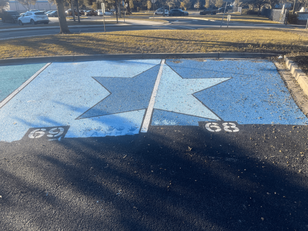
Spots 68 and 69:
This stellar spot duo is unquestionably fabulous. Based on the coordinating color scheme and the clean, straight lines one can infer that these parking spots are the result of careful planning, concentration, and a close friendship. Personally, I’m very impressed by the symmetry of this star, especially considering that these spots are in fact curved. The only qualm I have is that the paint on spot 69 extends slightly further than the paint on spot 68. In total, I think that these parking spots are very impressive. I give them a 9.5 out of 10.
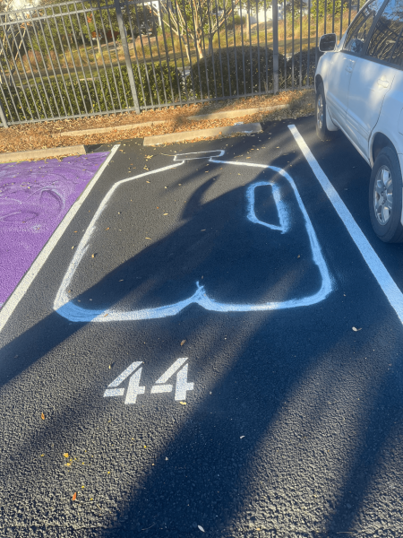
Spot 44:
I have a lot of questions about parking spot 44. It appears to just be an outline of a milk jug. The inspiration behind this design choice is apparently left up to interpretation. If you are the senior who painted spot 44, please comment on this article and explain your rationale for this choice because I am morbidly curious. Disregarding the subject of the parking spot, this individual obviously benefited from the parking lot being repainted over the summer as they did not have to paint the background of their spot. The lines used to make up the design are not inherently clean, likely a result of using spray paint. The color variety is lacking but it is a jug of milk so I guess that makes sense. Overall, I give this spot a 7 out of 10 because it made me laugh.
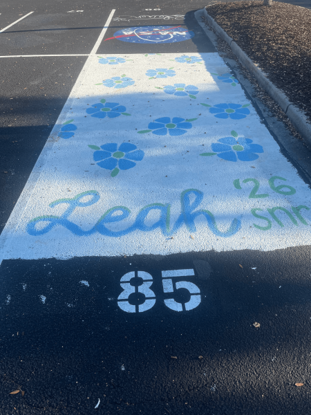
Spot 85:
Spot number 85 is simple, floral, and cute. I have a slight inkling that it might belong to Leah but as the parking lot is made of asphalt, I have no concrete proof. The blue, green, and white color scheme of spot 85 is very cohesive and aesthetically pleasing. The base layer of white paint appears to have minimal defects, creating a very clean look. In addition, I find the dual colored cursive lettering to be very impressive. Am I a little upset that all of the vowels have been removed from the word senior? Yes, yes I am. However, I think that this parking spot is overall pretty solid. For that reason, I give spot 85 a 9.8 out of 10.
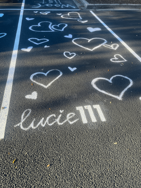
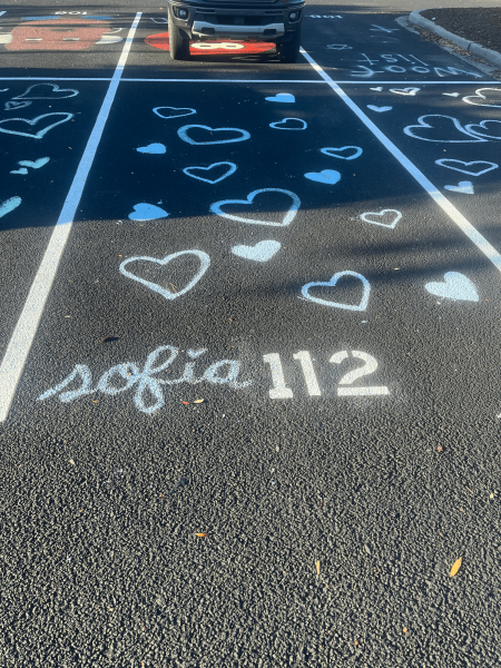
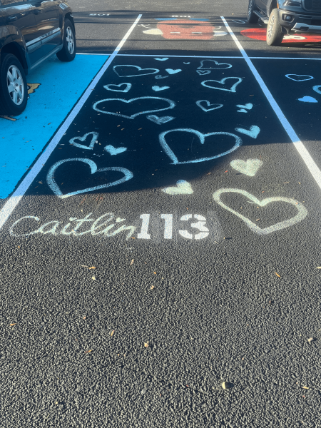
Spots 111, 112, and 113:
The students who painted spots 111, 112, and 113 obviously put a lot of heart into their work. The variety of heart types give these three spots undeniable character. By mixing heart outlines with filled in hearts and creating the hearts at different sizes and angles, these spots create a special kind of delightful chaos. Although their similar design unites these spots, they are made unique through the use of different colors. While the lines creating these designs are not perfect, I will give their painters some credit as they did paint them by hand, without brushes. Overall, I really like these three spots. I give them an 8 out of 10.
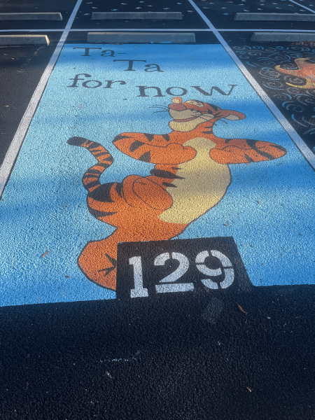
Spot 129:
Spot 129 obviously took a lot of careful planning, hard work, and dedication. I believe a grid was used to create this masterpiece. The cartoon tiger character, which is the focal point of the design, presents an obviously meaningful nostalgic component to this work of art which poetically contrasts with the idea of a senior year parking spot. Overall, the colors and design of this spot are cohesive and the lines that compose it are very clean. For emotional impact, execution, and vibes I give this spot a 10 out of 10.
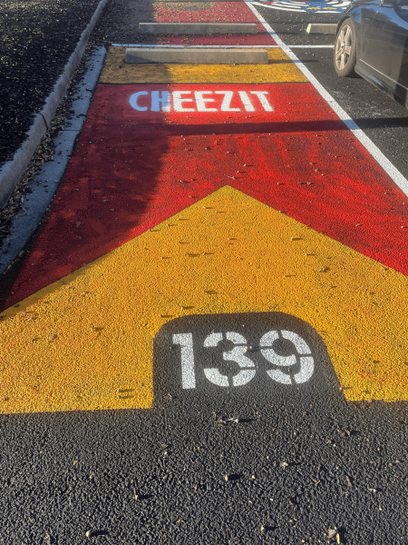
Spot 139:
This spot brings me a lot of joy. I don’t know why this particular individual decided to dedicate their parking spot to the brand Cheezits but it’s definitely a fun and unique idea. The color scheme of this design is obviously flawless as it is created by a very reputable source. I also find the accuracy of the font type to be quite impressive. The background color of this spot is slightly patchy, although I believe it was done with spray paint so that makes sense. Overall, I like this spot. I give it a 9 out of 10.
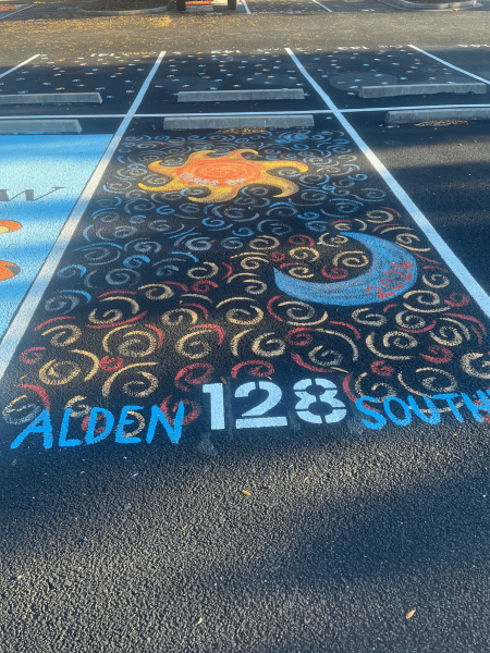
Spot 128:
This artsy parking spot is one of my personal favorites in the senior lot. It is very colorful and a wonderful example of negative space being used to enhance the design. Although the asphalt is not fully coated in paint, the entire spot is still filled with designs in the form of colorful swirls. I also enjoy how the color scheme of the swirls contrasts with the astral element that they surround. Overall I think this spot is really cool and creative. For those reasons I give it a 9.9 out of 10.
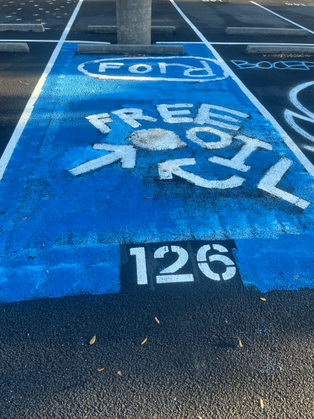
Spot 126:
Spot 126 is a spot that genuinely confused me when I first saw it being painted, mostly because the words “free oil” are written fairly slanted. However, I do think that this spot has an element of providing comedic relief. The bright blue of the background is definitely fun and eye-catching. Overall, I think this spot is fairly decent. My only real problem with it is that some of the letters in the word “Ford” seem to be connected for reasons I don’t quite understand. For these reasons I give parking spot 126 a 6 out of 10.
In conclusion, the senior class of 2026 is very fun, artistic, and occasionally odd.These characteristics will likely once again serve them well the next time they feel called to legally graffiti a parking lot. There are many more other fun parking spots out there so feel free to wander the parking lot until you find your favorite one.








Jack Childers • Nov 20, 2025 at 2:43 pm
It was me, idk I like milk