
Analyzing Senior Parking Spots
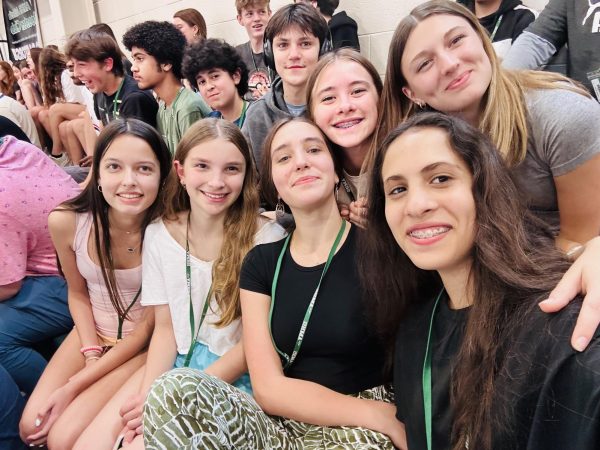
The class of 2023 showed their creativity in their parking spot painting, so we wanted to share that creativity with the school.
With the finishing of the AMHS senior parking spot painting, we wanted to examine some of the many creative designs now decorating the campus. The seniors of the class of 2023 undertook a wide variety of designs, each with their own great qualities. Some took advantage of the previous year’s painting, some used collaboration across more than one spot to produce a cohesive picture, and even still some created masterpieces from the ground up, with only the parking lot pavement as a base. Unfortunately, we are not able to cover each spot as there are so many, so if yours is not featured, we apologize. Also, it is our hope that any criticisms present in the article will not be taken to heart, as they are not serious at all. Enjoy!
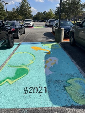
Koi Pond:
This koi pond design is very creative, using the previous painting’s blue color to provide the foundation for the water of the pond. The koi swimming through the pond paints a peaceful image, and the lily pads bring the design together by creating the environment of the fish. While the design is well planned out, the execution slightly detracts from the spot as a whole. The lily pads, unfortunately, are not completed, and while their incompleteness does not prevent from understanding and appreciating the design, it leaves something to be desired by the audience. Overall, this spot is very well done, especially the fish themselves, which I nearly mistook for live ones swimming through the pavement.
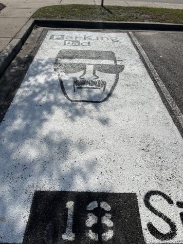
Parking Bad:
My name is Walter Hartwell White. I live at 308 Negra Arroyo Ln, Albuquerque, New Mexico, 87104. This is my confession: this parking spot is awesome. Incorporating references to the hit show, Breaking Bad, in all aspects of the design, this parking spot clearly portrays an appreciation for all things Heisenberg. The “Parking Bad” title of the spot perfectly recreates the title of the show, even incorporating a different periodic table element for the “P” in parking. In addition, the main attraction of the spot, the Heisenberg drawing, is a picture perfect recreation of the drawing from the show itself. The mustache, the flat mouth, the sunglasses, and the flat hat, are all superb. Unfortunately, the forehead wrinkles are missing, bringing down the immersion only slightly. As a big time Breaking Bad fan, this parking spot hits all the right criteria, I only wish I had this idea myself.
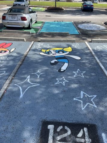
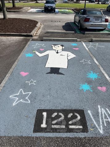
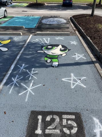
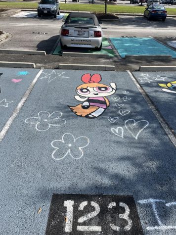
Powerpuff Girls:
This is the first of several examples of designs that collaborate across several spots, and these four do it very well. The foundational design is cohesive across all four, with a good choice of base color that provides great contrast with the characters themselves. The base color has a healthy thickness, with very limited visibility of the pavement beneath, further improving these spots’ appeal. The accessory designs, such as the hearts, stars, and flowers, are consistent while still maintaining a visible change across spots that further highlight the characteristics of each character present. Blossom, Bubbles, Buttercup, and Professor Utonium all look as if they were pulled directly out of their show. Overall, these spots are very well executed, from the solid background to the characters on each spot.
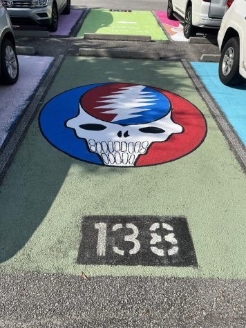
Grateful Dead:
While I am not the biggest Deadhead myself, I can fully appreciate the design and execution of this beautiful parking spot. First, the choice of background color works well under the logo, making the red and blue stand out while not looking out of place. The logo itself is very well done, with a healthy coat of paint and attention to detail. The sharp edges of the lightning bolt are perfectly executed, and the deep black of the eyes and nose tie together the vibrant red and blue. The logo is perfectly circular and nicely centered in the middle of the spot, an aspect that very much pleases me. Well done, spot 138.
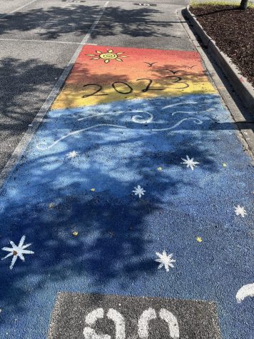
2023 Sunset:
This parking spot is expertly done, the blend of colors is nothing short of phenomenal. The gradient of the yellow, orange, and red perfectly resembles our beautiful Charleston sunsets, along with the deep blues of the ocean. This spot does not stop there, however, with the artist opting to add a number of details that truly bring together the scene. The artistic sun is truly an eye catcher, along with the simplistic birds. The inclusion of our graduation year, 2023, is one that will continue this spot’s legacy into next year. For the water, the waves in the shallows to the stars in the deep present an excellent contrast of day to night. Overall, this spot is very well done, and although it is one of a minority without some sort of pop culture reference, it does not detract from the spot in the slightest.
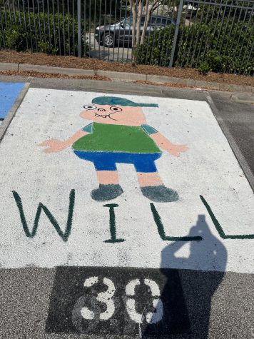
Clarence:
I was a big Clarence fan as a younger child, so this spot gains some points for me right off the bat. Although I would have opted for Sumo instead, I cannot complain about Clarence at all. First off, the choice of white as the background color was a good one, as it makes the character of Clarence himself pop off the spot, and there is very little visibility into the pavement below. Unfortunately, however, it seems that some of the time used to perfect the thickness of the base coat could have been better spent perfecting some of the details on Clarence himself. The lines between body parts and clothes are not as sharp as could be, and the fingers are somewhat indistinguishable. Clarence’s teeth are the same color as his skin, along with his left eye, which looks somewhat disturbing. It seems that an outline was started on Clarence’s sleeves, but it was not finished. Again, let it be known that these criticisms are entirely too nitpicky, and not intended to be taken seriously. Well done Will, and I appreciate the reference to one of my favorite childhood shows.
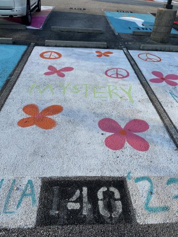
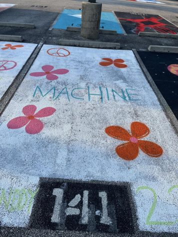
Mystery Machine:
The Mystery Machine is the van in which the characters of “Scooby-Doo” drive around. Fred Jones, the leader of Mystery Inc., drives the van with a gang full of crime fighters. Unfortunately for these spots, the actual Mystery Machine actually maintains a yellow and turquoise coat. We can cut these designers some slack because they combined their design across two spots, and yellow and turquoise paint are hard to come across. The hawaiian flowers and peace signs across the space spark a necessary pop in the parking lot. Obviously, the best indicator is “Mystery Machine” which is written across the spot, potentially because of the lack of correct colors. The execution was done with the correct purpose, but another coat of white paint would have really pulled the spot together. Overall, the collaboration of spots 140 and 141 make the spot significantly noticeable on top of the creative design from “Scooby-Doo.”
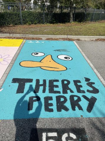
There’s Perry:
For those who do not know, Perry the Platypus is a character from the classic show, Phineas and Ferb. Perry, also known as Agent P, works for a secret spy organization that employs animals. “Where’s Perry?” is a popular phrase that is stated by Perry’s owner, Ferb Fletcher and Phineas Flynn. Clearly, the “There’s Perry” stated on the parking spot adds a nice joke to the painting. The painter of this spot put significant time into their work, maxing out the space and covering up the spot number. The nose, eyes, and hairs of Perry were definitely drawn out beforehand and filled in with precise paint. The turquoise paint of the background was, no doubt, not easy to find, along with the perfect yellow of Perry’s nose. The complex creativity of the drawing, along with the beautiful design and flawless execution makes this spot a fantastic addition to the AMHS parking lot.
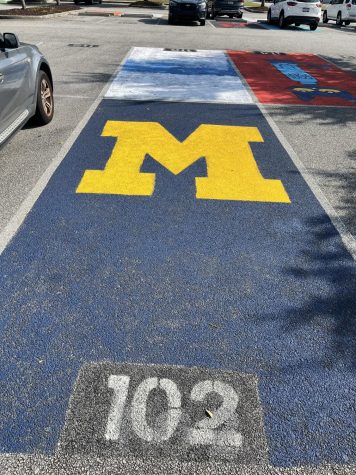
Michigan:
Clearly a Michigan logo, Spot 102 definitely has some great attributes. While the creativity may lack, the precision and form of the design pulls the painting together. The designer most likely drew out the lines beforehand, potentially with chalk, which shows that he/she put significant time and effort into the artwork. The simplicity of the logo allows for a doable design without a mass usage of paint. The artist purchased the ideal blue and yellow to go with the Wolverines’ colors and filled them in beautifully. The “M” most definitely features numerous coats of yellow paint which makes the spot pop extremely identifiable, especially to college football fans. Overall, not much else could have been done to improve spot 102; the painter used ideal colors with a well-executed design.
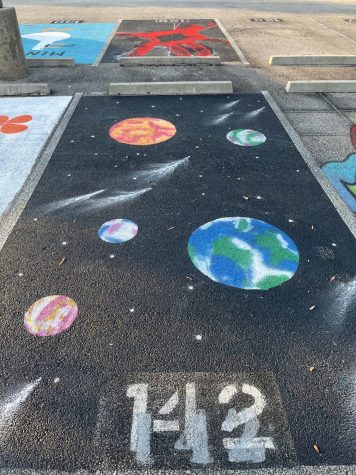
Planets:
Spot 142 is spectacular. The artist clearly put in sufficient effort at each step of the way. Beginning with the background, it is not easy to have a black coat with that much volume. The black background also goes well with black background of the spot plate. Although the design may lack creativity, the painting expresses excellent execution which makes up for any slander. The planets deserve to be noted. Firstly, the perfect circles. Yes, they may have been done with a tool, but not many people used perfect shapes. The planets are spread out to fill in the parking space and feature beautiful coloring. One can clearly see the continents upon earth and the red and yellow planet potentially acts as Mars. The details of the asteroids and stars only adds to the execution of the spot. Overall, Spot 142 features a fantastic, yet simple, painting which stands out in the parking lot.
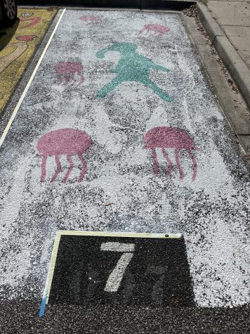
Bikini Bottom:
Obviously a Spongebob fan, the painter of this spot made Squidward the main character. The idea is fairly creative, as it could have just been a jellyfish painting. The artist clearly went out of his/her comfort zone in order to follow through with the idea. A background is also not easy, but is most necessary to fill out a spot. Unfortunately the painter lacked white paint; another coat or two would have not only made squidward and the jellyfish pop, but also would have made the painting pop. The design is done well; the jellyfish and squidward are drawn and outlined with perfection. Once again, the painting job takes away from the design. Overall, the design and creativity are fantastic, but the execution restricts the true potential of the painting.
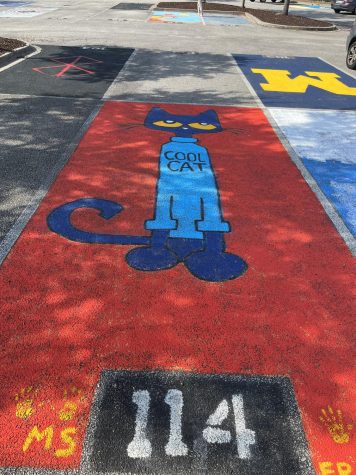
Pete the Cat:
The primary feature of the spot, Pete the Cat, is the main character of a popular children’s book. A series of four books about Pete were inspired by author James Dean’s love of his own cat. Pete is drawn beautifully upon spot 114. The spot was most definitely drawn out beforehand, potentially with chalk, with each line based off of how Pete is drawn in his novels. The painter made sure to fill out the drawing accurately across the entire spot, as the tail swings out almost reaching spot 115. Each detail is perfected, with a plethora of paints. Light blue paint for the shirt, dark blue paint for Pete’s body, yellow paint for his eyes, and white and black paint for his pupils; the dedication portrayed by the designer is admirable. Background is a common problem with AMHS parking spots, as many people do not do multiple coats, understandably. The artist here clearly put significant emphasis on the bright red background which makes the spot one hundred times better. Overall, spot 114 features an extremely creative idea, carried out with an accurate design and precise execution.