
Ranking High School Football Uniforms in CHS
“If you look good, you feel good. You feel good, you play good.” -Deion Sanders
This week I chose to review the uniforms of schools in the Charleston Area. I only did 10 because it was hard to find good photos of the uniforms, Also, I chose who I considered to be the most relevant teams. There are justifications following the photos. Of all of the schools I looked at, these uniforms made up the top 10.
1.Porter-Gaud School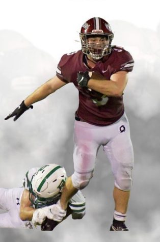
Porter Gaud claimed the top spot on this list for a few reasons. First, their new Nike uniforms (pictured) look great. The garnet, gray, and white work really well together. Their helmet, the Riddell Speedflex is the same one worn by pros, so kudos for player safety. Also, the gloss garnet paint with “Cyclones” written across it in cursive looks really good. Their uniform is very University of Alabama-esque. Consequently, the Cyclones play just as good as they look. But really, what would you expect from a school that’s $20,000+ a year? Overall: 10/10 (plus they stomped B.E.)
2. James Island Charter High School
The Trojans fall just below Porter for one reason only, their color scheme is just not very unique. I must say, JI has the best helmet of any team in the area, the Vicis Zero2 is the model pictured. The large trojan head looks much better than the old “JI” logo they have rocked in the past. The pants are really well done too. The pant stripes complement the jersey stripes. These uniforms remind me a lot of the University of Florida Gators home combination. Overall 9.5/10
3. First Baptist School First Baptist is the only team on this list with an Adidas brand deal. Their logo is a more simplified version of Porter Gaud’s logo but I still like it. The uniforms pictured were also worn by the Citadel in the mid 2010’s but in their light blue. First Baptist has a very nice helmet to complement these uniforms. The silver flake with the purple and white stripe ties it all together. I also had to give them bonus points because most of their players have really cool accessories. Overall: 8.5/10
4. Oceanside Collegiate Academy OCA has three standard uniform sets they wear: white, all black, and blue. The blue ones are pictured. Of the three, their all black is my favorite. The Oceanside uniforms look pretty good but they are just simple to me; there isn’t a lot going on in my opinion. Their “O” logo is exactly the same as the University of Oregon “O”, and I think the lack of creativity takes away from the uniform. Moreover, their “Landshark” logo is very elementary. I placed Oceanside fourth because they had a lot of untapped potential for a “sports school”. Overall: 8/10
5. Philip Simmons High School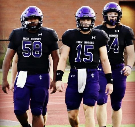 I should preface these next few rankings by saying that most schools in Charleston that have an Under Armour brand deal wear the same uniforms. All of these jerseys will be the same block letters, with different stripes, and different text on the bottom of the collar. That being said, Philip Simmons High School did everything right with what they had. Their purple, black, and gray color scheme looks really good. I have to give them props for being able to pull off purple pants. This school actually has two helmets to choose from; a matte black option and a purple option (pictured). I think the blacked out face masks are a nice touch as well. The only reason I have for ranking PSHS this low is because they lack originality. However, of all of the jerseys that follow this template, theirs looks the best. Overall: 8/10
6. Wando High School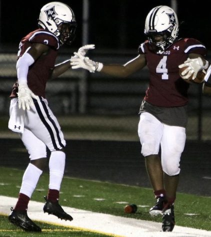
Another Under Armour jersey, this time in crimson. Their jersey text just says “Wando” but what else is there to say? This uniform reminds me of the University of South Carolina’s home uniforms in the mid 2010’s. Wando’s color scheme is basic so they really didn’t have a ton of options. The classic gloss white helmet they use isn’t bad, it’s just not good. The “W” logo looks just like Furman’s and there are tons of other schools in the state with the same style logo, just with a different letter. It doesn’t really help Wando’s case that they have a bad team at a school of 4,000 students. They’ve got to step it up in the equipment room and on the field. Overall: 7/10
7. Academic Magnet High School I’m sure some people are surprised to see Magnet this low on this list, but I have plenty of reasons. The Magnet football team is the only team on this list that does not have a brand deal with a major sports company (i.e. Nike, Under Armour, and Adidas). I feel that this characteristic holds them back. With only two uniforms and maybe four possible combinations, there is a lot of room for improvement. The black uniforms are the better of the two, and they look good for the annual “Blackout” themed game. They did change it up by putting the Raptor logo beneath the collar. As far as the helmet goes, they’re pretty outdated, the raptor logo is clean but that’s about its only redeeming quality. Also, the helmets need their facemask colors matched ASAP! I understand from some of the football players that since the numbers on the jerseys are vinyl, not stitched, that they peel off too. I am not writing this to be critical of those who provide us with such materials, but rather to call for more attention to the Academic Magnet sports teams’ uniforms issues. Overall: 6.5/10
8. Hanahan High School These uniforms look like they were sent straight from Boise State University. The all blue with the orange helmet just doesn’t do it for me. The stripes look awkward on most of their players, and instead of writing “Hawks” on the front they stitched “Hanahan” which is just impossible to read. Their helmets, just like Magnet’s, are outdated. I believe these uniforms are rather old; however, they still wear them. It’s pretty obvious it’s time for an update. On the contrary, Hanahan destroys opponents week-in and week-out consistently every year, so maybe the uniforms are a good luck charm… who knows. Overall: 5.5/10
9. Bishop England High School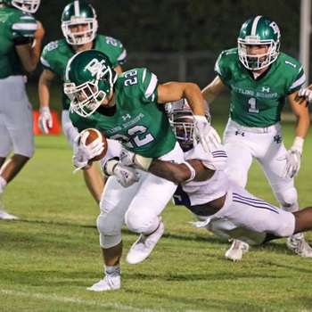 I don’t even want to get started on Bishop England. These kids pay a comparable price to kids at Porter Gaud and they get stuck with a green, navy, and white color scheme. I almost think these jerseys would look better if they only had green and white. The intertwined “BE” on the helmet is the most basic thing ever, the logo doesn’t even have a secondary color or accents. Also, the Bishop’s jerseys are the same as Wando and Philip Simmons, just worse. They lose points for making people pay just to look like public school teams. A very subpar performance for the Bishops I must say. I guess that makes sense since they play subpar football, with a win-loss record of 1-6. I would rank BE at the bottom of this list but it would get edited out for being too biased, but spot #9 is the best I can do. Overall: 4/10
10.Lucy Beckham High School These kids are just atrocious. I don’t know who decided to let Lucy Beckham have an orange, navy, and NEON GREEN color scheme, but they need to be stopped right now. The all navy look with neon outlined numbers is just bad. Their helmets have a pretty unique Bengal logo on the side but that is their only redeeming quality. I was informed that the school has separate “varsity” uniforms, but LBHS cannot field a varsity team till next year due to their lack of seniors. Hopefully, the equipment staff can help these kids out, but there is a long way to go if you ask me. Overall 3/10
Honorable Mentions:
Below were teams that I thought had really cool uniforms, but weren’t exactly relevant to the greater Charleston area. In all honesty, a lot of these teams made up the bulk of my list but I had to cut them out to stay on topic. If you want to see these uniforms for yourself you can just google them or look on the team’s Instagram page.
- Summerville High School
- Pinewood Prep
- Northwoods Academy
- West Ashley
- Ashley Ridge (INCREDIBLY slept on)
- Goose Creek (only because they recently signed a brand deal with Jordan, the first team in the area to do so)