Raptor Car Rankings pt. 4
Will your car be featured this edition? All owners have been notified of this ranking.

Hi Raptors! This is the fourth issue of a series of articles ranking cars in the AMHS school parking lot. After careful deliberation, a 50 point scale was developed to properly rate the cars:
- 10 points- Uniqueness (car stickers, car color, etc.)
- 10 points- Overall cleanliness (exterior)
- 15 points- Car Design (vintage, recent model, etc.)
- 15 points – Overall Aesthetics (appeal, satisfying finish)
After suggestions from a few peers, we have decided to be more strict when enforcing our ranking scale, and including adding multiple pictures of the cars featured.
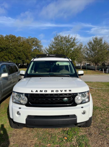
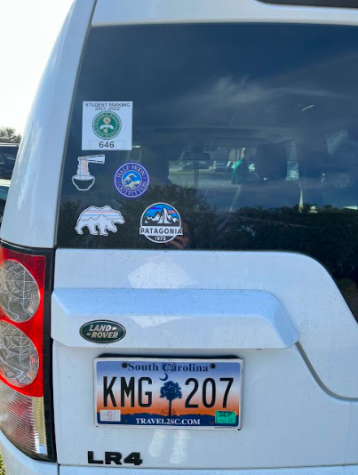
This white, Half-Moon Outfitters inspired Land Rover earns an almost perfect score of 42/50. Some of the strong points on this car were in the car design and overall aesthetics categories, in which the car earned 13 points in each. Next, this car was definitely one of the cleanest cars in the gravel lot, and earned 9 points in the overall cleanliness category. But, I thought a weak point for this car was in the uniqueness category, and more specifically the car stickers. As shown, there are five stickers kind of clumped into the bottom left corner of the car, and I think the four stickers on the bottom are nicely placed, but the Magnet parking sticker on the top just ruins it. Also I’m not the biggest fan of chopsticks and ramen sticker, mainly because I don’t feel as if it goes with the Patagonia and Half-Moon Outfitters vibe of the rest of the stickers.
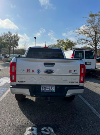
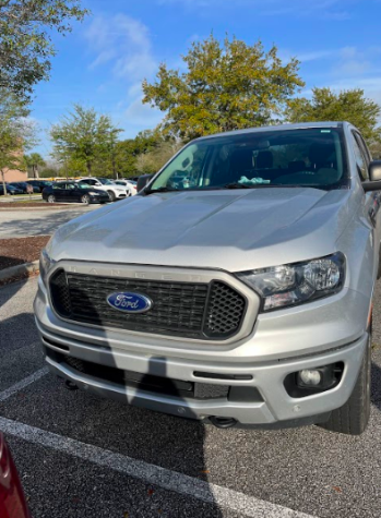
This light gray Ford Ranger has some clever sticker placement in my opinion, so I gave it a very high score (9 points) in the uniqueness category. I thought these stickers were also very symmetrical, because the KENYON sticker on the bottom right balances out the Jones Ford logo on the bottom left side of the truck. If I had to change something, I would probably add another circular shaped sticker or two to the right of the Ford logo. Next, the car received pretty average scores in the overall cleanliness category (5 points) and the overall aesthetics (8 points). In my opinion this car kind of suffered in the car design category, because I am really not the biggest fan of the Ford Ranger car itself, because as shown in the picture below, the font of the car kind of looks like the font of a minivan and not a truck. Therefore, I had to give the car only 5 points in the car design category, bringing the total points to a 27/50.
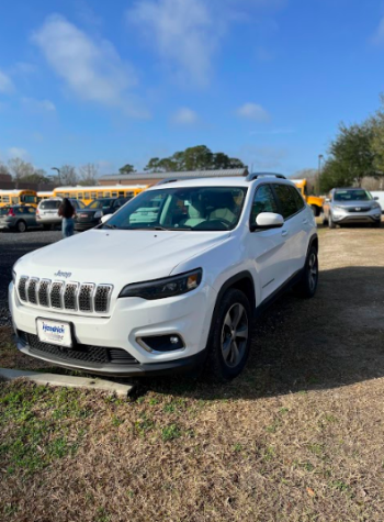
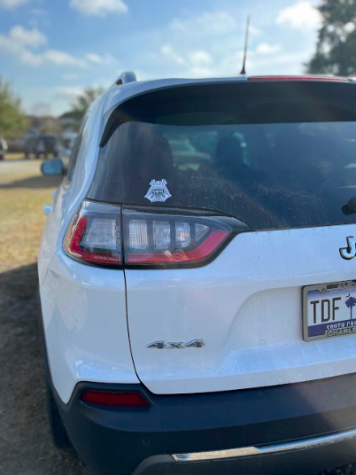
I would say for the most part, there is nothing that really jumps out to me about this car, except for the parking job. I don’t know if the owner of this car was just late to school this day, or this is an everyday occurrence for them, but even Mr. Cosgrove was astonished at how badly this car was parked. Because of this, the car got a meager 3 points in the aesthetics category, which took a major hit to their overall score. Besides this, the car has a singular Yeti sticker on the back and a Hendrick front license plate, revealing that this car was probably recently bought, and leading me to believe that this parking job is the result of a new driver. Personally I wasn’t a big fan of the sticker on the front license plate so the car got 4 points for uniqueness. Overall, this car earned a 22/50.

Personally, a Hyundai Tucson is one of my favorite car models. They are not too big but also not too small, so I gave the car a generous 12 points in the car design category. I think the stickers on this car are a little plain, so it earned a decent 5 points in the uniqueness category. In the future I would definitely want to see the car’s owner add a little more personality to the car, maybe some more stickers or a cute front license plate. Although you cannot really tell in the picture, this car is actually very dirty, I would even call it grimy (black cars show dirt very well), and is in desperate need of a car wash. Because of this I gave the Tucson only two points in the overall cleanliness category. Overall, the car earned a 28/50, which is actually not too bad.
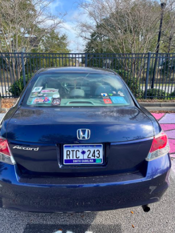
You would definitely recognize this dark blue Honda Accord on the road, and I don’t necessarily think that it is a bad thing. Obviously, the thing that pops out on this car is the large number of stickers and I actually think they all work really well together, because some of them have bright fun colors that pop while other stickers are more neutral. I especially like the large Grateful Dead sticker and the Look Pretty Play Dirty sticker on the right side. I gave this car 8 points in the uniqueness category, and it could have gotten more if the placement of some of these stickers were a little more uniform and spread out. The car got 7 points in the car design category, because I feel like a Honda Accord is a pretty basic car, and this car also looked just a little dirty, so it got 4 points in overall cleanliness. Overall, this car earned a 29/50.
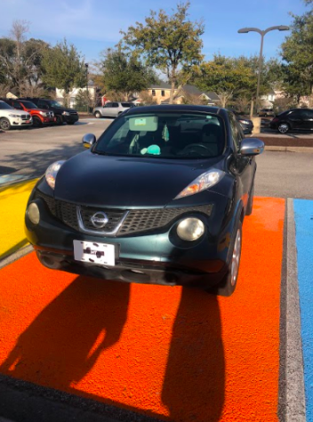
Next is the Nissan Juke. Unfortunately this car is one of the lower scoring points in this issue. This car certainly earns a perfect 10 points for uniqueness; it is pretty rare to see another Juke driving around considering they are no longer being manufactured. Additionally, the dark teal color really makes this car stand out from the rest. In considering the overall cleanliness of the car, the Juke was pretty dirty: a few dashes of bird poop and some scratches. This is a practical car design as it is small enough to easily fit into a parking spot and still has four doors and a sufficiently roomy interior. Unfortunately, I must dock this car some major points in the overall aesthetics due to the front plate. I am just not a fan of the soccer ball with the student’s initials over it. So, with 10 points for uniqueness, 4 points for cleanliness, 12 points for car design, and 0 points for aesthetics, this Juke earned 26/50 points.
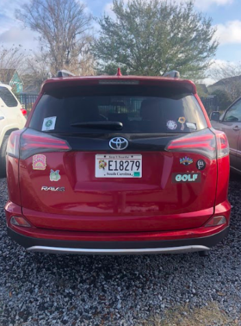
Unfortunately, this Toyota only earned a score of 29/50. In terms of uniqueness, this car did stand out to me but not necessarily in a good way. I think understand what kind of vibe this student was going for with their stickers, but I feel like the execution could have been better. The stickers are placed sloppily along the rear of the car, to me the placement feels awkward and uneven. Additionally, I’ve got to admit I am not a fan of the stickers, something about them just don’t sit well with me. I must admit, disregarding the stickers, this car earns full points for cleanliness, it was like looking in a mirror. Another redeeming feature of this Toyota is the license plate; I think the flowers are a very cute touch.

This Toyota Highlander is a pretty solid vehicle. At first glance, nothing about his car really stood out to me, Highlanders are pretty common and the color of the car isn’t really anything special. But what really drew my attention was the interesting sticker placement. Most people put their stickers on their rear window or somewhere near that area, but this student carefully arranged them in a line on the back bumper. I thought that this was really interesting and I actually think it looks good, so this certainly earned the Highlander several points for creativity. I would say it is average in all other aspects of the grading scale, so overall this car earned a solid 34/50.
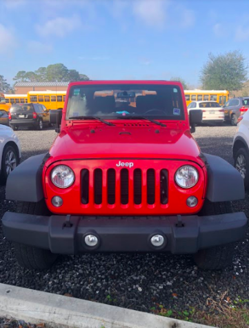
This red jeep wrangler is tied for the highest score in this issue, a 42/50. The first thing that stood out about this car was it’s bright, bold red color. Although there are plenty of red cars in the parking lot, I feel like none came close to how bright and bold this shade of red was. Furthermore, this car was in impeccable condition, it was super clean and scratch and dent free, if you told me you just got it from the dealership I would totally believe you. I feel like the Wrangler is a car you can’t go wrong with. What really pushed this car to reaching its maximum potential on our grading scale was the pink dashboard duck and King Kong dangling from the sun visor.

This Volvo is one of the higher scoring cars in this issue, with a total score of 37/50. This car caught my eye as soon as walked to the gravel lot to take pictures for this issue. Personally, I think it is just a super cool looking car and one that you don’t see too often, so it earns full points in the category of uniqueness. Another great aspect of this car was the color, the light blue/grey is really pretty. In the category of cleanliness, this car earned a medium score as it was pretty clean but there were some pretty dark scratches on the rear. This car earned major points in car design and aesthetics. In terms of car design, I feel like the largeness of the rear window brightens up the whole car. Additionally, the rack pads and stickers really added to the overall aesthetic of the car.
We hope you enjoyed this fourth issue of Raptor Car Rankings! If you want your car to be rated, please email one of us, Mary Archambault (arcmar8543@ccsdschools.com) and Gracie Mochizuki (mocgra6372@ccsdschools.com) with your parking spot number as well as the car’s make and model. We would also like to give a special shoutout to Mr. Cosgrove, who every month takes time out of his day to walk around the parking lot with us. See you next month!


