Comparison of Magnet and SOA Campuses
Good Afternoon Raptors. Collin and I recently took a gander around both SOA and Magnet’s campus in order to compare the two in terms of their facilities. This was stiff competition, allowing for a continuation of the Magnet vs SOA feud. Let’s start off with:
- Magnet’s lecture hall/SOA’s Theatre
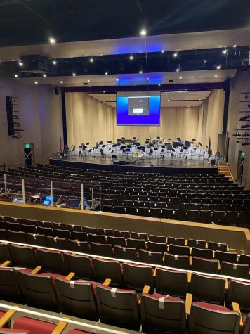
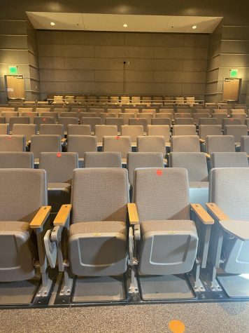
Now I think this one contains a more obvious winner. SOA’s theatre is twice the size of our lecture hall, with an all-around better atmosphere. I have a lot of love in my heart for Magnet’s lecture hall and all of the focus chats we used to undergo in it; howeve, SOA’s theatre will have to take the cake.
The side by side comparison really speaks volumes. Magnet’s lecture hall is, dare I say, bland. SOA really hit the nail on the head with their red seats; also their stage lights are simply vibey. However I am aware that Magnet does not necessarily possess the need for a larger lecture hall, and it isn’t really used that much anyway. This being said, I can understand why we could not match up in this round, but I would like to see better from Magnet in the future.
- Bathrooms
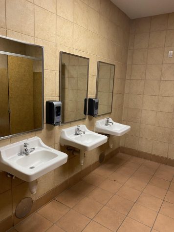
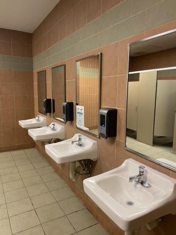
I was only able to step inside one of SOA’s bathrooms and I will say they were completely adequate. Bathrooms are bathrooms, and I did not see a huge difference between SOA’s and Magnet’s. One thing I will include however, is that half of Magnet’s stalls (specifically in the women’s restrooms) do not close unless you full force body slam yourself against it. I know all of the girls reading this know exactly what I am talking about. I did not spend enough time in the SOA bathroom to see if they also faced this problem, so I really can only judge on appearance. Magnet’s bathrooms are typically very clean and hardly ever smell bad. For what I saw in the one bathroom I examined, this seems to also be true for SOA. I would consider this round a tie.
As you can see there is barely any noticeable differences in the bathrooms of SOA (left) and Magnet (right). Magnet’s surprisingly does seem to have more color, which is surprising considering Magnet’s trend of dull colors throughout the school. Overall I’m not very impressed with the color scheme of either Magnet’s or SOA’s bathrooms but you can only expect so much from high school bathrooms. Both schools definitely need to work on their feng shui.
3. Vending Machines

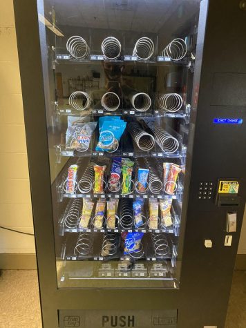
The vending machine at SOA really threw me off guard. Sweetarts, starbursts, and paydays all were available to the school’s students. No wonder they always got some pep in their step, they are high all the time (sugar high). SOA’s vending machine would give Michelle Obama a heart attack. Magnet’s vending machines are boring to say the least. No candy, hardly any options for chips, and the drink vending machine only offered water while SOA’s had Sprite, Coke, etc. Magnet also has much more empty aisles within their vending machine compared to SOA, giving SOA the dub for this category.
4. Gyms
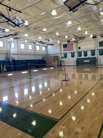
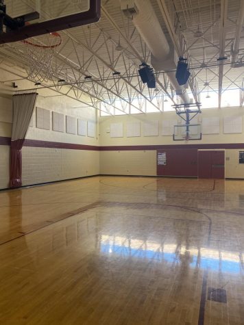
Magnet’s gym (one on the left) is possibly the only interior I prefer over SOA’s. The SOA gym is half size and not nearly as polished and clean as Magnets. In SOA’s defense they do not need as big as a gymnasium as Magnet considering they do not offer any sports that require a court such as basketball or volleyball. I enjoy the white lighting and open window vibe of Magnet’s gym and the state championships won throughout the past years. Also it is important to note that SOA highschoolers use Magnet’s gym for their physical education class so that is another reason why they are not in need of a bigger gym.
5. Hallway Decorations

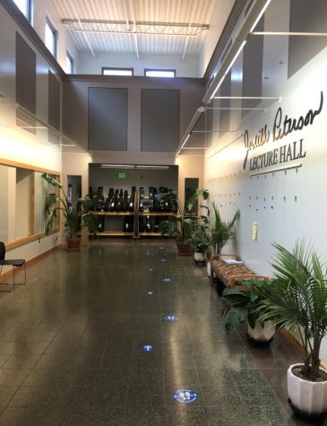
I chose the two most aesthetically pleasing hallways I could find on both campuses for this category with SOA being on the left and Magnet being on the right. I will start with Magnet, I enjoy the clean, green feeling of the Hallway. You can not see completely in the picture but it is also accompanied by ceiling windows that really pull the hallway together. However, this is not enough to beat SOA for their decorations in the hallway. Obviously this is not too surprising considering the School of the Art’s student’s are known for their artistic abilities. Immediately upon entrance of the Art building you can see a mural, countless paintings and drawings, and other art pieces.
Well that’s all we got for you guys. The School of the Arts seems to beat Academic Magnet in their interior design skills. Magnet seems to lean more towards simple decorations (or some would say the cheap route) while SOA seems to spice it up (or some would say care about their students enough to splurge for them).


