Flawed: City Benches
Charleston’s anti-homeless hostile architecture

If you’ve ever found yourself exploring the hidden wonders of Downtown and stopped for a quick rest on one of those ever-so recognizable black benches, you’ve probably thought to yourself: “I’m tired, but not tired enough to sit here”. But what if I told you that this lack of comfort was on purpose? And that people across the city are disadvantaged by it? Let’s find out.
City planners have one of the hardest jobs out there. Not only do they have to deal with the complicated flow of traffic and thousands of pages of demolition approvals, but they are constantly under the public eye of scrutiny. However, these very same people hold a great amount of power in everyone’s lives. This meticulous manipulation of everyday life is present in thousands of details all around us. Nothing is done without reason, even when it comes to your comfort.

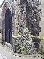
In the field of architecture, there is a secret design technique. It dates back to the 17th century, and it goes by many names. It’s been called defensive design, hostile architecture and many more, but the idea is the same: subtly manipulate the behavior of people. Some are obvious: street lights reduce crime, spikes keep birds off of buildings and false security cameras reduce theft. But others are harder to notice. For example, the aforementioned 17th century defensive design was to place rounded cones in the exterior corners of churches to prevent men from urinating there (not sure if this worked or not).
This type of architecture is ever present in Charleston, despite its historical foundation. Those rounded cones in church corners? Check out some of the neo-gothic churches downtown. Those small sea animals around liberty square by the aquarium? They aren’t just for decoration, they keep skateboarders off and away. All around the city, small details change the behavior of people to the designer’s liking.
As one can see, defensive design can have many benefits. But at what point does defensive design become hostile architecture? The name change is significant.
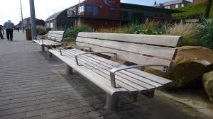
The behavior that city planners and architects wish to change when it comes to benches is fairly simple. Give people a place to rest, but not for too long. Relax, but not permanently. This goal is accomplished in several ways. Primarily, armrests are placed in the middle of benches so people can’t lie down. Uncomfortable materials are also used that often absorb the cold and keep it. Lastly, odd grooves and designs are used to make the seat uncomfortable on your back and behind.

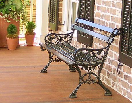
The classic Charleston bench that the city uses is made of black iron and wood. They’re located all around municipal Charleston in parks and historical sites and while they are indeed a classic and recognizable feature, they have their own elements of defensive design. For starters, the wood slats on the back and bottom have a significant gap in them, leaving the patron uncomfortable. Additionally, the length is slightly over 5 feet long, much shorter than the average human height.
To the average person, these details are only a minor nuisance. But to the homeless, elderly and disabled, they greatly impact their everyday life.
For the elderly and disabled, a casual afternoon walking around the city can often be tiring. Rest is needed, and these benches do not give it. In fact, many cities purposefully do not place benches on main shopping streets, simply to keep people moving and buying more. Businesses have taken advantage of this tactic, placing seating inside their stores to bring in more customers. This can be seen in the Belmond Charleston Place Hotel, where people are brought in to the lobby to rest on benches near expensive clothing stores.
For the homeless, the benches pose ever more of an issue. The problems with the Charleston bench are designed to be specifically annoying for those trying to lie down. The gaps between the wood are two large to comfortably lay on, and the space between the seat and back of the bench is large enough to roll through. Combine this with the short length and rough, iron ends and you get a very uncomfortable bed.
This targeting tactic is successful, and it does not go unnoticed within the homeless community. I spoke with a homeless man on Meeting Street about the situation, and he gave helpful insight. “They just don’t want us there in the pretty parts of town” he states. “it [the intentions] ain’t hard to miss”.
When it comes to city benches, hostile architecture is successful. It drives off the homeless and spurs moving and buying. But by including such designs in the open, inclusive spaces of town and culture, a strong message is sent about what kind of people are wanted.


