

Taking a Look at Moe’s New Logo
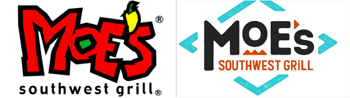
Do We Like Moe’s Re-Branding?
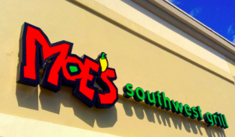
One of everyone’s favorite places to hang out with their friends in Charleston is Moe’s Southwest Grill. We know it for its iconic red font logo with a yellow pepper for an apostrophe. Overall, the place is very recognizable. But now, this restaurant chain has gone under a re-branding project. For more perspective, I asked a couple dancers from my studio, who I go to Moe’s with every weekend during rehearsals, to see what they think about Moe’s new logo.
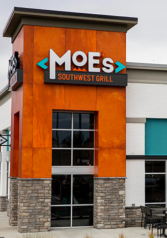
Moe’s new logo and overall restaurant image is more modern. They changed their theme colors from yellow, green, and red to black, teal, and orange. The font of the label is different. Even the menus look different. Overall, it seems like they have modernized to keep up with the times. Even though the phrase is “change is good”, some people think that some things just should stay the same and consistent. I personally do not have a strong opinion on this because if I am being honest the food still tastes the same, which is all that matters. When I asked the dancers at my studio what they thought about the new logo, it was an unanimous decision that they did not like it.
The reason why they do not like the new logo is because it just doesn’t feel like Moe’s. It is more modernized, which in many cases can be good, but not in this case. It feels like this new model is trying too hard to be something it is not. As cheesy as it sounds, the Moe’s old logo felt like it was part of its identity. One of the dancers at my studio explained how she felt the re-branding made the restaurant unrecognizable, although I find that opinion to be a tad bit dramatic. Overall it is safe to say that we are not a fan of the new logo, even though it doesn’t change the taste of the food. What do you think of the new logo?